Controls
Avalonia apps are made of high-level building blocks called controls, which allow you to quickly construct the UI for your app. Avalonia comes with lots of controls, including buttons, lists, tabs and more. These pages explain the essential functionalities of Avalonia controls—for detailed information, see the API Reference.
Buttons let your users take action. They're an essential way to interact with and navigate an app.
Use a checkbox for binary user decisions, such as feature toggles, survey questions or task lists.
ComboBox shows a selected item and displays a list of options when clicked.
A versatile control for displaying data based on a template.
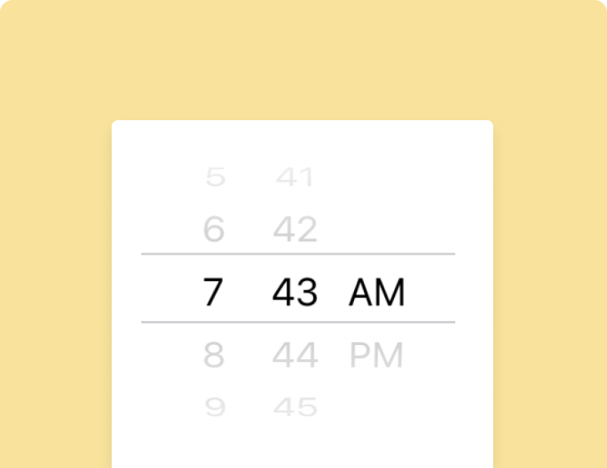
Date and time pickers present an interface for users to select dates and times.
The grid is a powerful layout control that arranges other controls in columns and rows.
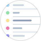
Lists display rows of information, such as a contacts, languages or music genres.
Display images and decide how they interact with other UI elements.
Use menus to organize user options and improve ease of navigation.
The progress bar helps users to visualize the completion status of an operation.
Radio buttons allow you to present a set of mutually exclusive options.
The refresh container provides pull-to-refresh functionality on a content component.
Sliders let users select a numerical value by moving a knob along a track.
Tabs enable tabbed navigation, a standard navigation pattern in modern apps.
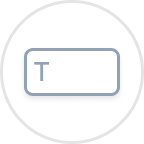
Text boxes create an area for text input—a staple of almost any type of app.
Toggle buttons switch between true/false states. Use for instantly reversible binary options, such as mute, dark mode or subscription status.
Have questions or feedback? Join the conversation below.