Property setters
Basic usage
The setters in a style define what properties will be changed after Avalonia UI has matched the control in the logical control tree using the selector, and determined which style is to be used. Setters are simple property and value attribute pairs in the XAML, written in the format:
<Setter Property="propertyName" Value="newValueString"/>
For example:
<Setter Property="FontSize" Value="24"/>
<Setter Property="Padding" Value="4 2 0 4"/>
You can also use a long-form syntax to set a control property to an object with several properties set, like this:
<Setter Property="MyProperty">
   <MyObject Property1="My Value" Property2="999"/>
</Setter>
A style can also set properties using bindings. After the usual selection process, this causes Avalonia UI to use a value from data context of the target control. For example, the setter can be defined like this:
<Setter Property="FontSize" Value="{Binding SelectedFontSize}"/>
Style priority
There are two rules that govern which property setter has precedence when a selector matches multiple styles:
- Position of the enclosing styles collection in the application - 'closest' has priority.
- Position of the style in the located styles collection - 'latest' has priority.
For example, firstly this means that styles defined at window level will override those defined at application level. Secondly, this means that where the selected style collections are at the same level, then the later definition (as written in the file) has priority.
If you were comparing style classes to CSS you must note that: unlike CSS, the list sequence of class names in the Classes attribute has no effect on setter priority in Avalonia UI. That is, if both these style classes set the color, then either way of listing the classes has the same result:
<Button Classes="h1 blue"/>
<Button Classes="blue h1"/>
Value reversion
Whenever a style is matched with a control, all of the setters will be applied to the control. If a style selector causes the style to no longer match a control, the property value will revert to the its next highest priority value.
Mutable values
Note that the Setter creates a single instance of Value which will be applied to all controls that the style matches: if the object is mutable then changes will be reflected on all controls.
Also note that bindings on an object defined in a setter value will not have access to the target control's data context. This is because there may be multiple target controls. This scenario may arise with a style defined like this:
<Style Selector="local|MyControl">
  <Setter Property="MyProperty">
     <MyObject Property1="{Binding MyViewModelProperty}"/>
  </Setter>
</Style>
This means that in the example above, the binding source for the setter will be MyObject.DataContext, and not MyControl.DataContext. Also if MyObject has no data context then the binding will unable to produce a value.
Note: if you are using compiled bindings, you need to explicitly set the data type of the binding source in the <Style> element:
<Style Selector="MyControl" x:DataType="MyViewModelClass">
  <Setter Property="ControlProperty" Value="{Binding MyViewModelProperty}" />
</Style>
Setter data templates
As previously described here, when you use a setter without a data template, a single instance of the setter value is created and shared across all matching controls. To change the value depending on a data template, you place the target control inside a template element, like this:
<Style Selector="Border.empty">
  <Setter Property="Child">
    <Template>
      <TextBlock>No content available.</TextBlock>
    </Template>
  </Setter>
</Style>
Setter precedence
Avalonia Setters are applied in order of BindingPriority, then visual tree locality, and finally the Styles collection
order. Precedence applies individually to each StyledProperty so that styling can benefit from composition. DirectProperty
and CLR properties cannot be styled and therefore do not participate in this precedence.
BindingPriority Values
Animation = -1, // Highest priority
LocalValue = 0,
StyleTrigger,
Template,
Style,
Inherited,
Unset = int.MaxValue, // Lowest priority
BindingPriority assignment in XAML
BindingPriority cannot be explicitly set in XAML. The following examples demonstrate how BindingPriority is
implicitly assigned across each scenario. This is crucial for designing and troubleshooting styles that work as expected.
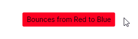
Animation
Animation has the highest BindingPriority and is applied to Setters within a Keyframe and generally throughout the
Transitions system.
<Button Background="Green" Content="Bounces from Red to Blue">
    <Button.Styles>
        <Style Selector="Button">
            <Style.Animations>
                <Animation IterationCount="Infinite" Duration="0:0:2">
                    <KeyFrame Cue="0%">
                        <Setter Property="Background" Value="Red" />
                    </KeyFrame>
                    <KeyFrame Cue="100%">
                        <Setter Property="Background" Value="Blue" />
                    </KeyFrame>
                </Animation>
            </Style.Animations>
        </Style>
    </Button.Styles>
</Button>
LocalValue
Assigned when a XAML property is directly set outside of a ControlTemplate. Both Background Setters below will
have LocalValue priority.
<Button Background="Orange" />
<Button Background="{DynamicResource ButtonBrush}" />
Resource markup extensions do not have any effect on priority.
StyleTrigger
When a Selector has conditional activation, the Setter's BindingPriority is promoted from Style to
StyleTrigger. Two selectors with any conditional activation will have equal priority regardless of the number of
activators present and the position of the activator within the selector syntax. Avalonia doesn't have CSS's concept
of Specificity.
<Style Selector="Button:pointerover /template/ ContentPresenter#PART_ContentPresenter">
    <Setter Property="Background" Value="Orange" />
</Style>
Style class, pseudo class, child position, and property match selectors are conditional. Control name selectors are not conditional.
Template
When a property is directly set within a ControlTemplate. BorderThickness, Background, and Padding below have Template priority.
<ControlTemplate>
    <Border BorderThickness="2">
        <Button Background="{DynamicResource ButtonBrush}" Padding="{TemplateBinding Padding}" />
    </Border>
</ControlTemplate>
Style
When a Setter is defined within a Style without conditional activation.
<Style Selector="Button /template/ ContentPresenter#PART_ContentPresenter">
    <Setter Property="Background" Value="Orange" />
</Style>
Especially noteworthy is the lower priority than Template. Therefore, these selectors cannot be used to override the
properties mentioned in the Template example above.
Inherited
When a property is not set, it may inherit the property value from its parent. This must be specified during
property registration or with OverrideMetadata.
public static readonly StyledProperty<bool> UseLayoutRoundingProperty =
    AvaloniaProperty.Register<Layoutable, bool>(
        nameof(UseLayoutRounding),
        defaultValue: true,
        inherits: true);
Visual tree locality
Setters with equal BindingPriority are then selected by their location in the Visual Tree relative to the Control. The
Setter with the fewest nodes required to traverse upwards to locate will take precedence. Inline style Setters have
the highest precedence for this step.
<Window>
    <Window.Styles>
        <Style Selector="Button">
            <Setter Property="FontSize" Value="16" />
            <Setter Property="Foreground" Value="Red" />
        </Style>
    </Window.Styles>
    <StackPanel>
        <StackPanel.Styles>
            <Style Selector="Button">
                <Setter Property="FontSize" Value="24" />
            </Style>
        </StackPanel.Styles>

        <Button Content="This Has FontSize=24 with Foreground=Red" />
    </StackPanel>
</Window>
Styles collection order
When BindingPriority and visual tree locality are both equal, the final decider is the order within the Styles
collection. The last applicable Setter will take precedence.
<StackPanel>
    <StackPanel.Styles>
        <Style Selector="Button.small">
            <Setter Property="FontSize" Value="12" />
        </Style>
        <Style Selector="Button.big">
            <Setter Property="FontSize" Value="24" />
        </Style>
    </StackPanel.Styles>

    <Button Classes="small big" Content="This Has FontSize=24" />
    <Button Classes="big small" Content="This Also Has FontSize=24" />
</StackPanel>
These Buttons specify their Classes in different order, but that has no effect on Setter Precedence.
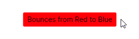
BindingPriority does not propagate
Recall the Animation example above. If you hover, the animated background is replaced with a static background
despite BindingPriority.Animation having the highest priority. This is because the Selector targets the wrong
Control. Examining the ControlTheme is necessary to diagnose the cause.
<ControlTheme x:Key="{x:Type Button}" TargetType="Button">
    <Setter Property="Background" Value="{DynamicResource ButtonBackground}"/>
    <Setter Property="Template">
        <ControlTemplate>
            <ContentPresenter x:Name="PART_ContentPresenter"
                              Background="{TemplateBinding Background}"/>
        </ControlTemplate>
    </Setter>

    <Style Selector="^:pointerover /template/ ContentPresenter#PART_ContentPresenter">
        <Setter Property="Background" Value="{DynamicResource ButtonBackgroundPointerOver}"/>
    </Style>
</ControlTheme>
The top Setter applies the ButtonBackground to the Button with Style priority. The Background rendering is
handled by the ContentPresenter which has a Template priority. It fetches the ButtonBackground which has been
applied to Button.
However, when the Button is hovered, the :pointerover Selector is activated with its StyleTrigger
priority, overrides the TemplateBinding, and fetches ButtonBackgroundPointerOver instead. This circumvents
fetching the Button's Background that our original Animation Selector targeted. This is summarized in the following table:
| Background Setters and Styles While Hovered | Priority | Location |
|---|---|---|
| LocalValue | Button | |
| Background="Red" | Animation (Overrides LocalValue) | Keyframe |
<ContentPresenter Background="{TemplateBinding Background}"/> | Template | ControlTemplate |
^:pointerover /template/ ContentPresenter#PART_ContentPresenter | StyleTrigger (Overrides Template) | ControlTheme |
Instead, we should target the ContentPresenter with a Setter that has priority of at least StyleTrigger. BindingPriority.Animation
fits that. This is an observation that cannot be made without examining the original ControlTemplate and emphasizes that relying
on priority alone is insufficient to effectively style an application.
<Button Background="Green" Content="Bounces from Red to Blue">
    <Button.Styles>
        <Style Selector="Button /template/ ContentPresenter#PART_ContentPresenter">
            <Style.Animations>
                <Animation IterationCount="Infinite" Duration="0:0:2">
                    <KeyFrame Cue="0%">
                        <Setter Property="Background" Value="Red" />
                    </KeyFrame>
                    <KeyFrame Cue="100%">
                        <Setter Property="Background" Value="Blue" />
                    </KeyFrame>
                </Animation>
            </Style.Animations>
        </Style>
    </Button.Styles>
</Button>
Have questions or feedback? Join the conversation below.