Elements tool
The Elements Tree presents a unified view that combines both visual and logical hierarchies. It loads only visible elements to optimize performance, while organizing the structure with the logical tree as the foundation. Template contents are collapsed away within /template/ node contents.
Inspect Mode
The Elements Tool offers ways to identify and select specific UI elements directly from your running application:
-
Focus Tracking - When enabled, this feature automatically selects the currently focused element in your application within the Elements tree. Toggle this mode with
Ctrl+Shift+K(orCmd+Shift+Kon macOS) to seamlessly track focus changes as you interact with your app. -
Inspect Element - This mode transforms your cursor into an element selector. Once activated with
Ctrl+Shift+C(orCmd+Shift+Con macOS), simply click any element in your application to immediately locate and select it in the Elements tree. This provides a direct bridge between what you see in your application and its underlying structure.
These inspection modes eliminate the need for manual searching through complex element hierarchies, making debugging and UI analysis significantly more efficient.
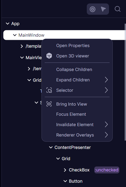
Context Menu
The context menu provides essential actions for navigating and manipulating the element tree:
When right-clicking on an element, you can access various expansion options to explore the hierarchy at different levels of detail. The "Expand Children" option reveals immediate children, while "Recursively" and "Recursively with templates" provide deeper exploration capabilities.
Additional actions include collapsing nodes, copying elements or their selectors, focusing elements, bringing them into view, and invalidating visuals. Window elements offer the special capability to render debug overlays such as FPS.
The entire tree supports search functionality, allowing you to quickly locate specific elements by name or type.
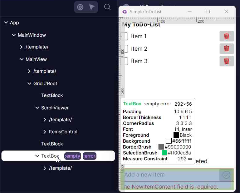
Pseudoclasses selector
For each element, the tool displays pseudoclasses that were defined on it. This feature is particularly valuable for testing how elements respond to different states without having to manually trigger them through user interaction.
When developing custom controls with pseudoclasses, adding the [PseudoClassesAttribute] improves integration with the Developer Tools and also enhances IDE auto-completion support.
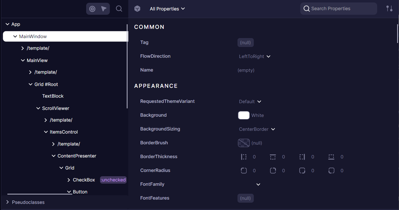
Element Properties
The Properties panel shows detailed information about the selected element in the Elements tree, displaying all properties, styles, and values affecting the element.
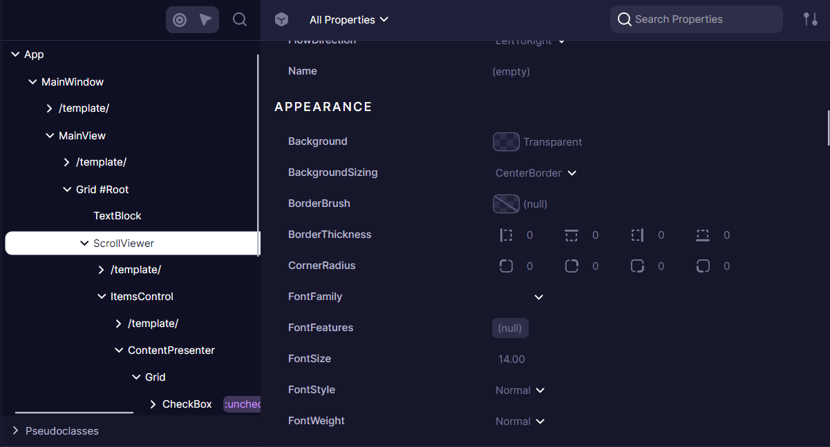
The panel displays all Avalonia properties assigned to the element. Developers can:
- Filter properties by name
- Sort properties alphabetically or by value
- Group properties by categories
- Edit values using specialized editors (ColorPicker, BrushPicker, Image/Geometry previews)
- Properties with nested grids are clickable, allowing to preview
DataContextorImage.Source-like properties.
Property Details
When a developer selects a property, additional details become available through two specialized tabs.
Styles and values
Avalonia properties operate on a priority-based system where multiple values can be assigned to a single property. The Properties panel reveals this layered approach:
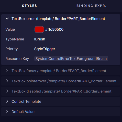
Each property can have multiple setters with different priorities and conditions. For example, a button might have different background colors defined for its normal state, hover state, and pressed state. The DevTools shows all these setters, with the currently active one expanded by default.
Inactive setters (those whose conditions aren't currently met) appear collapsed and grayed-out. This visual hierarchy helps developers understand which style is currently applied and why, making it easier to debug styling issues.
Binding Expressions
The Binding Expressions tab reveals how properties are connected to data sources:
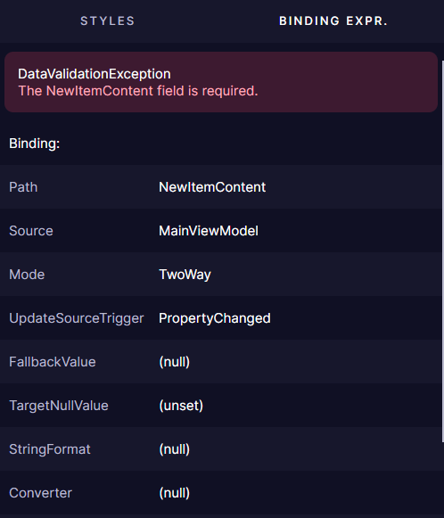
When a property uses data binding, this tab shows crucial information about the binding relationship:
- Source and Path of the binding
- Validation errors if the binding is failing
- Additional binding parameters like Mode, Converter, and FallbackValue
For properties with validation errors, the panel displays the exception type and message, including any inner exceptions that might provide additional context for debugging.
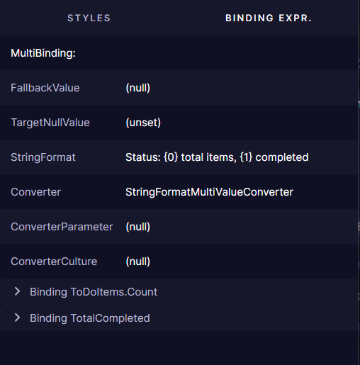
Some properties use MultiBinding expressions that combine multiple sources:
Element 3D Viewer
The 3D Viewer provides a three-dimensional visualization of your application's visual tree, allowing you to explore the layering and hierarchy of UI elements in a spatial context.
Accessing the 3D Viewer
Open the 3D Viewer from the Developer Tools panel by toggling the "3D Viewer" button on the Properties view toolbar. Or from "Open 3D Viewer" context menu in the Elements Tree.
Any visual element subtree can be viewed. Templates and root Application cannot.
This feature requires Avalonia 11.2.0 or newer.
Features
The 3D Viewer renders each layer of your visual tree as a separate plane in 3D space.
Elements are positioned according to their Z-index and rendering order. Allowing to easily identify overlapping elements and their stacking context
Navigation Controls
Navigate the 3D space to examine your UI from different angles:
- Rotate: Click and drag to rotate the view
- Pan: Right-click and drag to move the camera position
- Zoom: Use the mouse wheel to zoom in and out
- Reset: Double-click to reset the view to the default position
Visualization Settings
Customize how the 3D view renders elements:
- Draw as Gradient: Toggle to visualize elements with gradient coloring for better depth perception
- Draw Borders: Enable or disable element border rendering for cleaner visualization
- Layer Distance: Adjust the spacing between visual tree layers
- Layer Range: Set minimum and maximum layer indexes to focus on specific depth ranges in the visual tree
3D Viewer Use Cases
- Debugging Z-Index Issues: Identify and resolve element stacking problems
- Understanding Complex Layouts: Visualize how nested panels and controls relate to each other
- Optimizing Visual Tree: Identify unnecessary nesting or redundant containers
- Explaining UI Architecture: Use as a teaching tool to demonstrate visual tree concepts
In-App Overlay
Avalonia Developer Tools provides visual overlays that display directly on your running application, helping you visualize and debug UI components without code modifications.
Enabling Overlays
You can activate overlays in two ways:
1. Via Elements Tree
Overlays automatically appear when hovering over elements in the Developer Tools tree.
2. Via "Highlight Elements" Mode shortcut
Enter inspect mode directly in your application:
- Press
Ctrl+Shift+H(Windows/Linux) orCmd+Shift+H(macOS) - Hover over any element to see its overlay
- If necessary, this mode can be disabled by pressing the same shortcut
Available Overlays
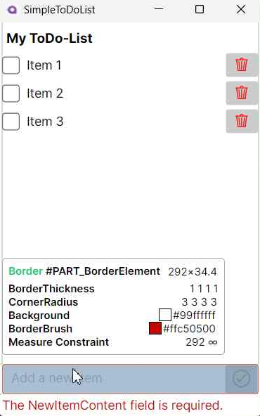
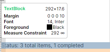
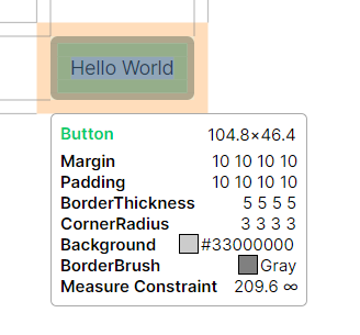
Info Tooltip
Displays detailed element information when hovering:
- Basic Information: Element type, name, and style classes
- Layout Properties: Dimensions, margins, padding, constraints, and Z-Index
- Visual Properties: Border and background details, colors and opacity
- Text Properties: Foreground color, font settings
- Control-Specific Properties: Selection brushes, image details
Layout Overlay
Visualizes UI structure with color-coded highlights:
- Margin: Semi-transparent highlighting of margin space
- Padding: Semi-transparent highlighting of padding
- Bounds: Solid border around actual control boundaries
Ruler Overlay
Provides measurement references:
- Horizontal and vertical rulers along window edges
- Guide-lines connecting content boundaries to rulers

Have questions or feedback? Join the conversation below.